Restructured navigation, content architecture, and product hierarchy to shift from content sprawl to a focused, PHR-first experience. Removed unused community features, aligned taxonomy to MedlinePlus standards, and introduced AI-enhanced search to improve clarity and findability.
Project scope
Role
UX Designer
Timeline
2024
Team
Design, Content, Engineering, CEO
Status
Shipped
Context
My client began as a broad health content platform layered onto a developing personal health record (PHR). The product hierarchy placed library content, communities, and PHR at equal weight, creating confusion around the core business.
Content was organised alphabetically within loosely defined “Channels,” and search relied heavily on keyword matching, leading to inconsistent discovery and poor information hierarchy.
Problems
Feature sprawl diluted product focus
Library structure mirrored internal CMS logic rather than user mental models
“Channels” terminology confused users
Search returned entire health topics instead of specific articles
Community boards were unused but retained structural prominence
Navigation hierarchy did not reflect product priorities
Strategic shift
I advocated for repositioning the PHR as the core product experience, with the library serving as contextual support. This required rethinking navigation hierarchy, removing unused community features, and restructuring the content taxonomy to align with established health topic standards.
The solution was not a visual redesign — it was a structural realignment of the product’s core hierarchy and priorities.
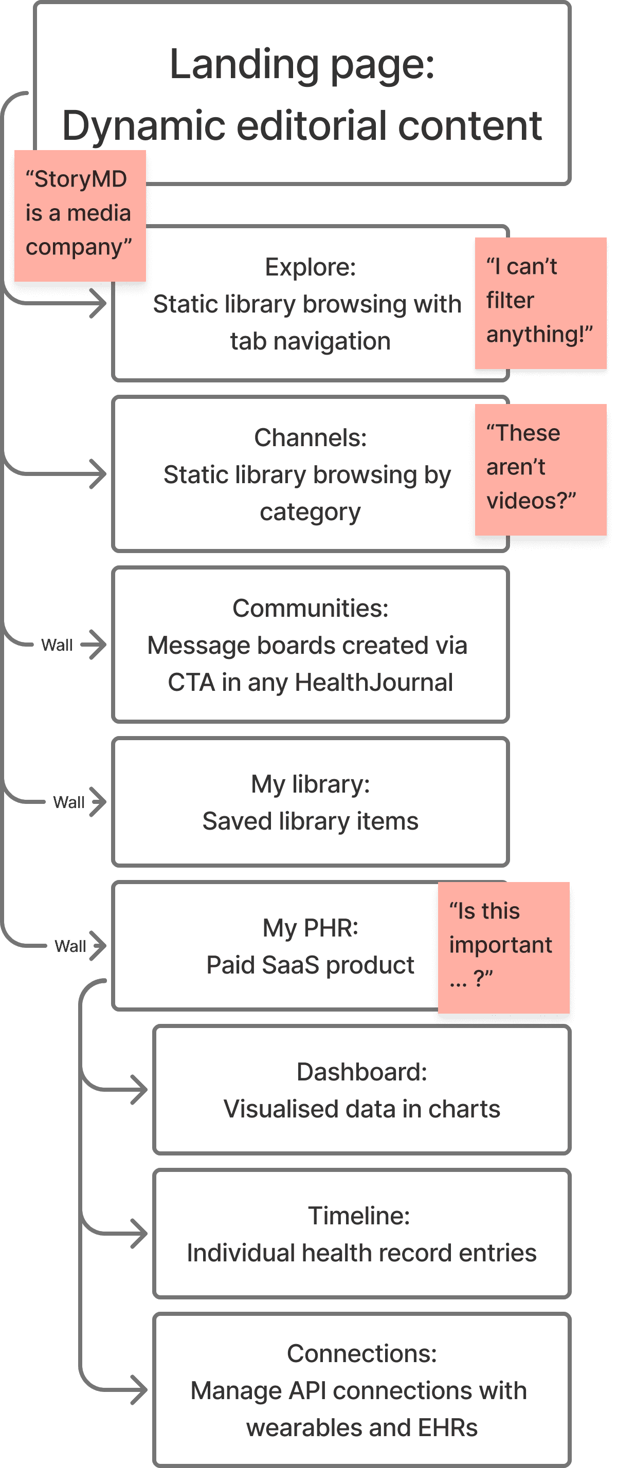
Original StoryMD high level navigation
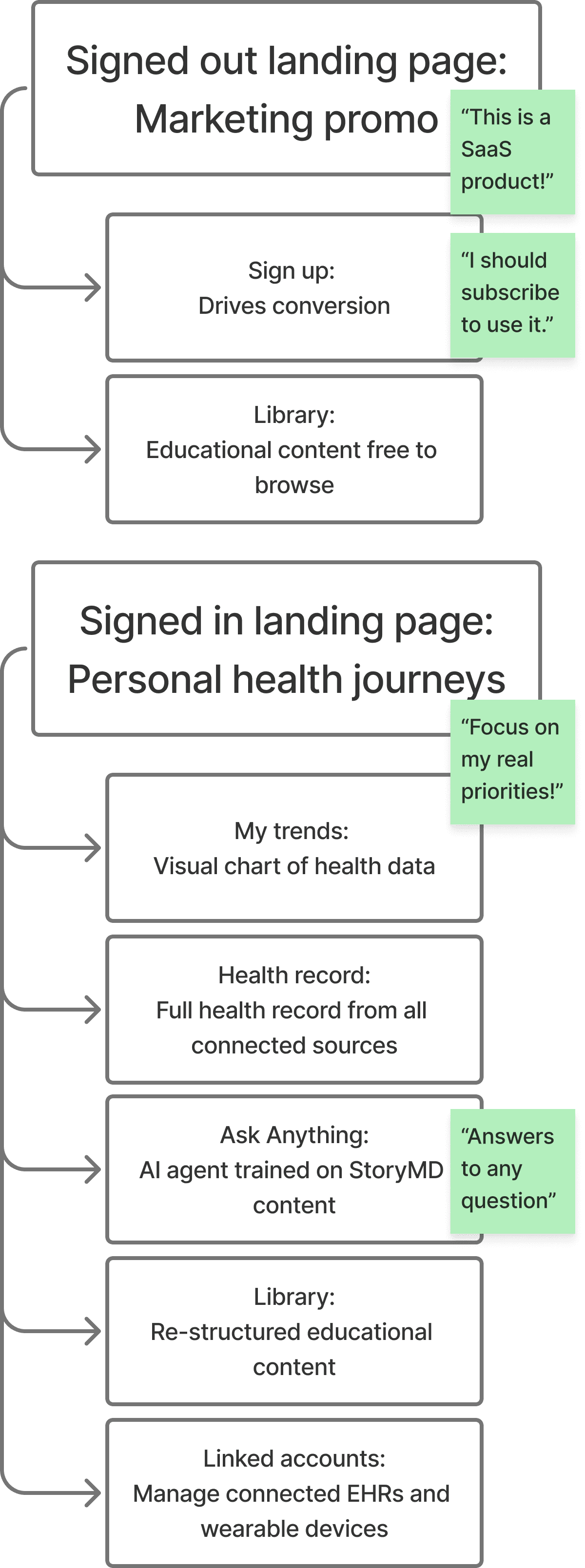
New StoryMD high level navigation
Remove noise
Community boards removed
Free-tier account removed, streamlining sign up
Align to mental models
Top-level taxonomy aligned to MedlinePlus health topics
Restructure navigation
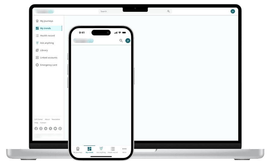
Side navigation (desktop)
Bottom navigation (mobile)
App-like immersion
Architecture & navigation redesign
With the strategic shift to PHR-centred design agreed, I iterated primary navigation designs with my fellow designer, landing on an immersive app-like left-hand desktop navigation and lower mobile navigation. The site no longer placed the PHR on a level with Library and Communities, forcing users to drill down within the PHR to access medical information.

Original and new landing pages and navigation

Original and new library organisational structure
Improving search through structured logic
Before
Initially, the search results returned entire health topics. Users were confused as the links on the search results page directed them to the a health topic hero page and not to the specific article applicable to their search term.
And this wasn’t the only issue we encountered. Due to the search matching titles and keywords in the CMS, there was little to no hierarchy in the results returned and at times the results seemed entirely unrelated. Add to this the fact that simple glossary definitions were hidden in a third tab and you had search results that frustrated and confused users.
After
We implemented a layer of AI-powered search, allowing us to generate the most accurate and relevant search experiences. It fed search queries through a proprietary large language model (LLM) to understand the intentions behind searches and serve personalised results for each person.
With appropriate results being returned we also showed results for individual articles, and returned relevant glossary results as a card at the top of the screen, ensuring users got the answers they were looking for.
After addressing problems with the library search results we also fixed the issue of having search bars in different areas of the site. If a user wanted to search for items in their health record the field was treated as a filter. We combined them all into a global search that allowed users to search any area of the site, but that defaulted to the user’s current location.

Original and new search results pages
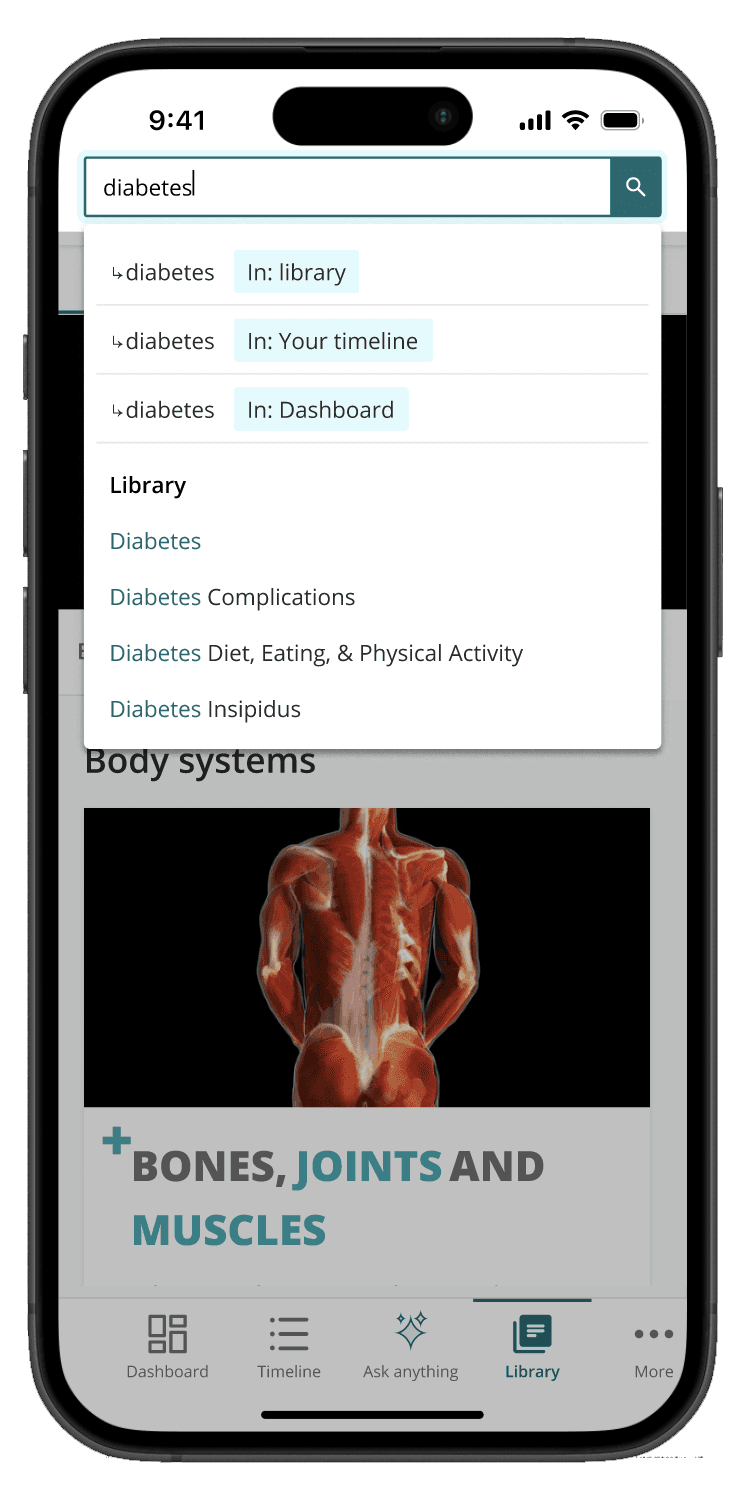
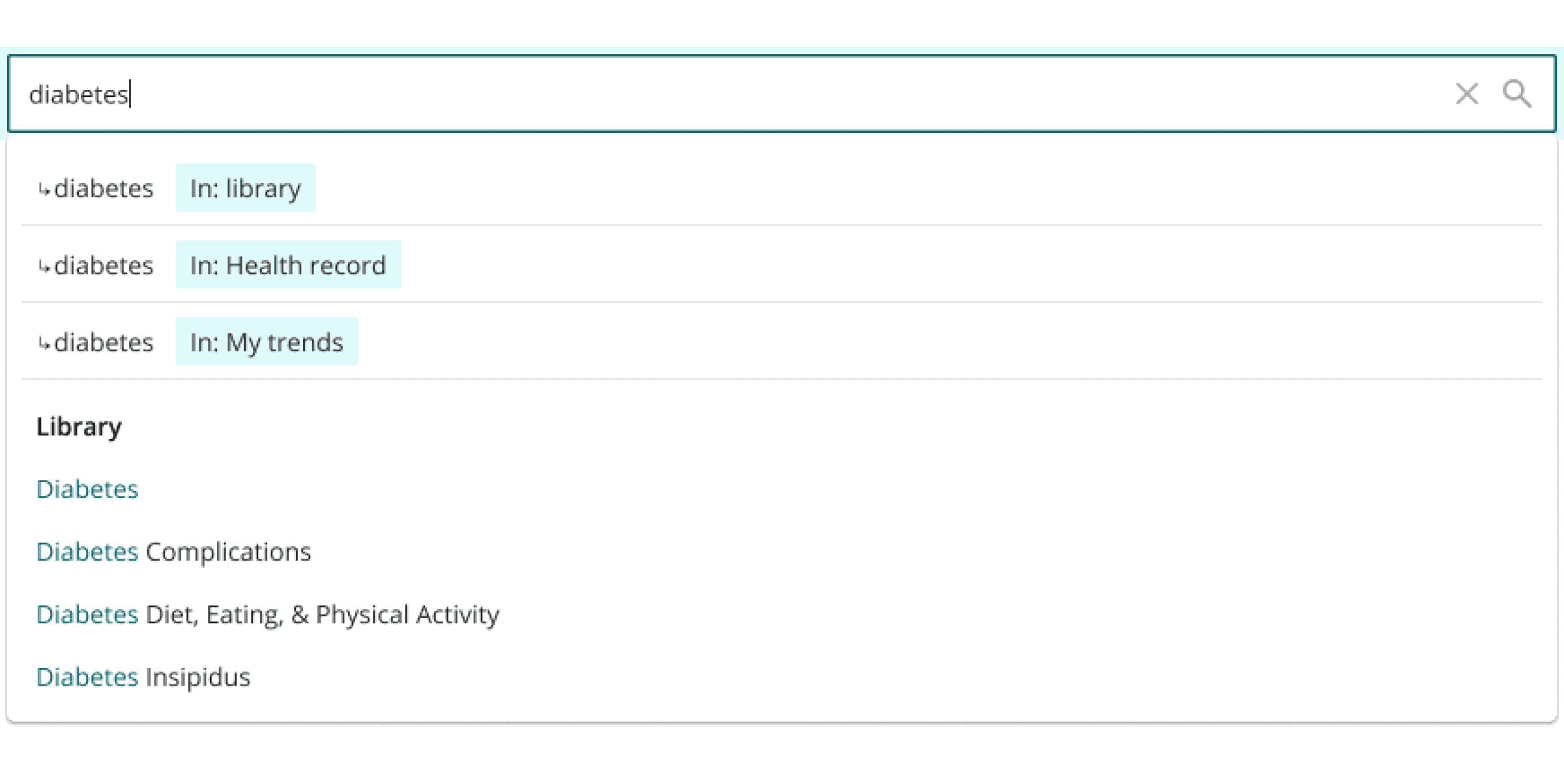
New global search autocomplete field
Outcomes
Reflection
This initiative required balancing founder vision with user clarity. By prioritizing structure over expansion, the platform became more cohesive and strategically aligned — setting the foundation for subsequent AI and workflow innovations.